P0 (fix now — site/money broken)OBSERVED
shopify merch · open · checked 2026-07-28
What we saw
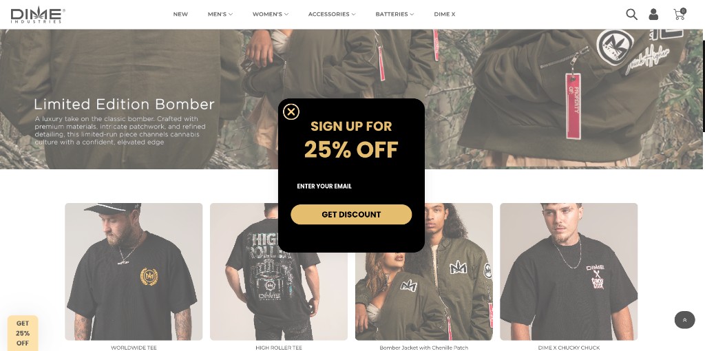
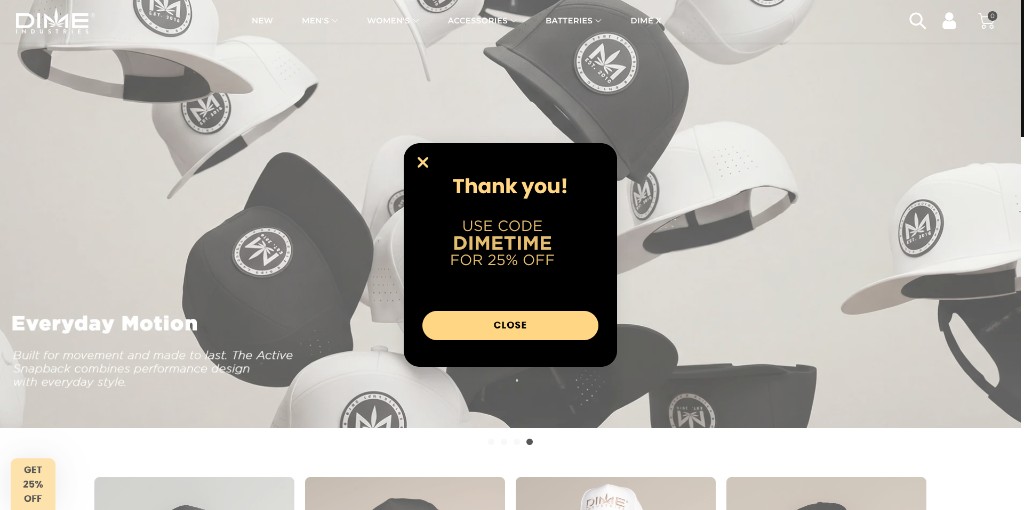
Manual QA screenshot shows a full-viewport signup modal over the merch catalog on desktop. A second screenshot shows a Thank You / DIMETIME 25% OFF state that still blocks browse. Escape reported as refresh-only in firsthand testing. Agent wander pass also captured the same Klaviyo “SIGN UP FOR 25% OFF / GET DISCOUNT” overlay on a desktop viewport (z-index ~90000). Mobile popup behavior has not yet been fully verified and should not be treated as confirmed; double-check the live Klaviyo form/popup rules. No other merch-blocking overlay beyond that signup modal was newly proven on /collections/all after dismiss timing.
What should happen
Email capture should be dismissible without trapping the shopper; post-signup messaging should not continue to block catalog browsing.
Why it matters
Direct merch conversion blocker on the Shopify storefront — shoppers cannot evaluate products until they clear or fight the modal. Highest business-priority fix among this QA set.
How to check it yourself
- Open https://www.dimemerch.com/ (or dimemerch.com → www) in a desktop browser.
- Observe the full-screen “SIGN UP FOR 25% OFF” / GET DISCOUNT modal before browsing products.
- Complete email signup (or dismiss if possible) and note whether a Thank You / DIMETIME state still occludes the storefront.
- If browse remains blocked, refresh the page as the escape hatch.
Suggested fix: Tune Klaviyo (or theme) popup: delay/trigger on intent, always-available close, and non-blocking thank-you. Double-check Klaviyo desktop vs mobile targeting, then verify first-visit vs returning cookies.
Notes: HTTP 2026-07-28: dimemerch.com → www.dimemerch.com is Shopify (powered-by Shopify). Page HTML includes Klaviyo onsite JS (company_id Yuah9v) and magnific-popup assets. Blocking popup/thank-you behavior is screenshot-verified on desktop only; live trigger timing can vary by cookie/geo. Mobile remains incompletely verified — confirm in Klaviyo before treating it as confirmed. Wander screenshots: wander-shopify-desktop-001.png, wander-shopify-mobile-001.png (mobile capture is provisional).
Caveat: Aggressive email capture is a common Shopify growth tactic. Tradeoff: list growth vs. immediate browse friction. Current implementation appears past the useful threshold.
P1 (high — hurts users sitewide)OBSERVED
broken links · open · checked 2026-07-28
What we saw
Multiple Lab Results hrefs coexist: https://coas-7d1e18b1a038.herokuapp.com/ (200), https://dimeindustries.com/lab-results/ (200), and https://dimeindustries.com/?page_id=17 (404 Whoops). Oklahoma/contact/app/find-us footers include the broken page_id=17 target.
What should happen
Every Lab Results footer/nav control should open the current COA destination consistently.
Why it matters
Trust/compliance signal is broken for shoppers seeking lab transparency — a high-stakes cannabis brand moment. Also creates inconsistent destinations across templates.
How to check it yourself
- Open a non-home page such as https://dimeindustries.com/oklahoma/ or /contact/ or /app/.
- In the footer HELP/company column, click LAB RESULTS when it points at ?page_id=17.
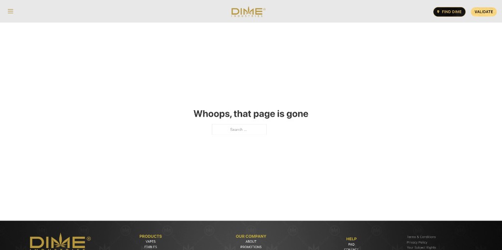
- Land on the branded 404: “Whoops, that page is gone”.
Suggested fix: Audit all menus/footers/widgets for Lab Results; point every instance to one canonical URL; 301 legacy page_id=17; remove stale custom links.
Notes: Independent probe 2026-07-28: GET ?page_id=17 → HTTP 404 with H1 “Whoops, that page is gone”. Homepage also still mixes heroku COA + /lab-results/. Screenshot footer-lab-results-001.png captures the Whoops 404 chrome (hamburger + FIND DIME / VALIDATE).
Caveat: Unlikely intentional. Looks like a migrated WP page ID left in a footer template while other templates were updated to heroku or /lab-results/.
P1 (high — hurts users sitewide)OBSERVED
navigation · open · checked 2026-07-28
What we saw
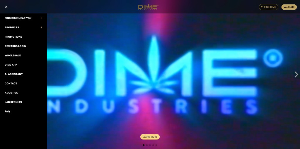
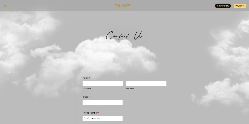
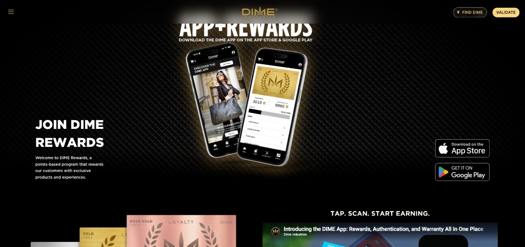
Desktop chrome uses hamburger + overlay sidebar. Primary IA is collapsed until opened. Same pattern observed on Contact and App/Rewards landing screenshots.
What should happen
Desktop typically exposes primary destinations (Products, Find Dime, Lab Results, Rewards) without an extra click behind a mobile pattern.
Why it matters
Adds friction to every high-intent path (buy, find store, validate, lab results). Increases bounce risk for desktop paid/organic traffic.
How to check it yourself
- Open the homepage or Contact / App+Rewards pages at a desktop viewport width.
- Note the hamburger control instead of a persistent horizontal desktop nav.
- Open the menu and observe the left sidebar with FIND DIME NEAR YOU +, PRODUCTS +, LAB RESULTS, etc.
Suggested fix: Introduce a true desktop nav (or hybrid mega-menu) while keeping hamburger for small breakpoints. Keep FIND DIME / VALIDATE header CTAs.
Notes: Bricks theme pattern. Screenshots show desktop-width layout with hamburger. May be intentional brand/minimal-header choice — document tradeoff before redesign.
Caveat: Possibly intentional minimal header aesthetic. Tradeoff: visual simplicity vs. desktop discoverability. Still a revenue/UX risk even if deliberate.
P1 (high — hurts users sitewide)OBSERVED
canada · open · checked 2026-07-28
What we saw
Most Canada nav destinations 404: /lab-results, /store-locator, /locations, /products, /events, /about. Validate and Contact return 200. AI Assistant points at a dead myftpupload.com host. Merch still reaches dimemerch.com.
What should happen
Primary Canada destinations (labs, stores, products, AI help) should resolve to working pages, or links should be removed/hidden until those pages exist.
Why it matters
Canadian visitors following the main link hub hit dead ends for trust (lab results), retail discovery, catalog, and AI help — undermines the intentional-separate-.ca story and looks unfinished.
How to check it yourself
- Open https://www.dimeindustries.ca/ (Links / Canada landing).
- From the top link row, open Lab Results, Store Locator, Locations, Products, Events, or About.
- Land on the branded “Page Not Found” (HTTP 404).
- Also open AI Assistant — it leaves .ca for https://nh7.88d.myftpupload.com/ (GoDaddy Managed WordPress temp domain) which also 404s.
Suggested fix: Audit every Canada Links href: publish the missing pages, point to working US/COA equivalents where legal, or remove the dead links. Replace the myftpupload AI URL with a real assistant (or remove until ready).
Notes: Agent wander 2026-07-28: HTTP GET confirmed 404 for lab-results, store-locator, locations, products, events, about, and nh7.88d.myftpupload.com. Validate + Contact 200. Related to QA-008 (separate Canada feel) but this is hard broken-link evidence, not just IA/branding.
Caveat: A sparse Canada landing can be intentional for legal/regional reasons. Shipping a full nav of 404s is not — that looks like unfinished Webflow/CMS routes or leftover staging URLs.
P2 (important — confusing or hard to find)OBSERVED
navigation · open · checked 2026-07-28
What we saw
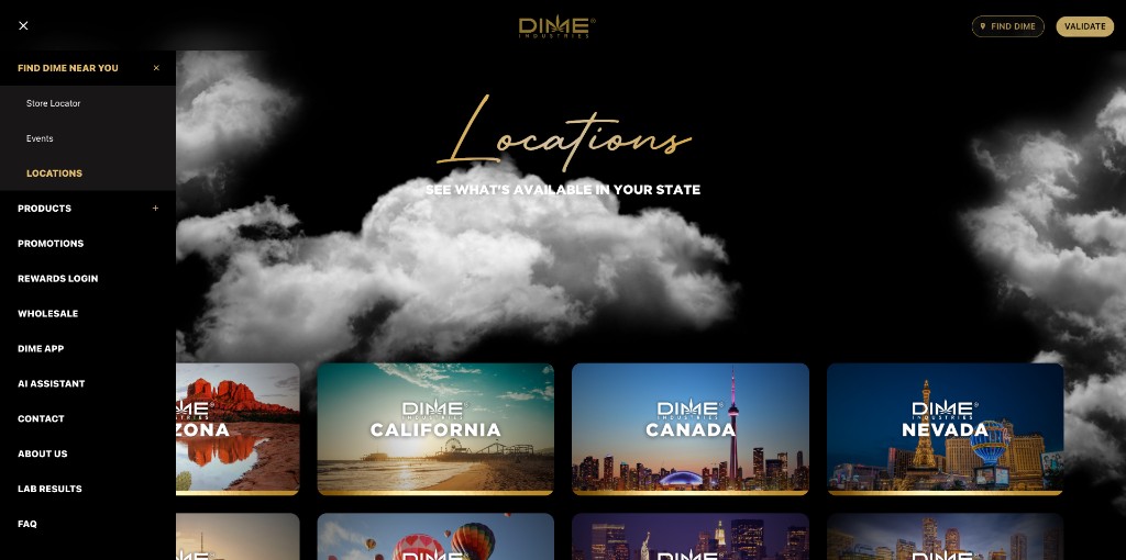
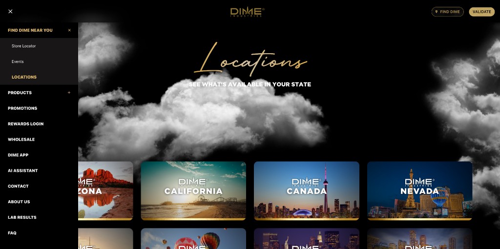
Those destinations sit behind a collapsed accordion in an already-hidden hamburger menu. Locations grid page screenshot shows the expanded state with Store Locator / Events.
What should happen
Store Locator and Events should be one-click discoverable for users seeking retailers or brand activations.
Why it matters
Retailer discovery and event attendance are core growth loops; burying them reduces completed “find near me” journeys.
How to check it yourself
- Open the sidebar nav on desktop.
- Note FIND DIME NEAR YOU shows a + accordion control.
- Expand it on the Locations (/locations/) experience to reveal Store Locator and Events nested underneath.
Suggested fix: Promote Store Locator (and optionally Events) to top-level nav items or always-expanded desktop children; keep FIND DIME header CTA wired to locator.
Notes: Related to QA-003. Header FIND DIME button mitigates somewhat (links to /find-us/), but Events remains harder to discover.
Caveat: Grouping under FIND DIME NEAR YOU is reasonable IA; the problem is stacking collapse (hamburger + accordion) on desktop.
P2 (important — confusing or hard to find)POSSIBLE
store locator · open · checked 2026-07-28
What we saw
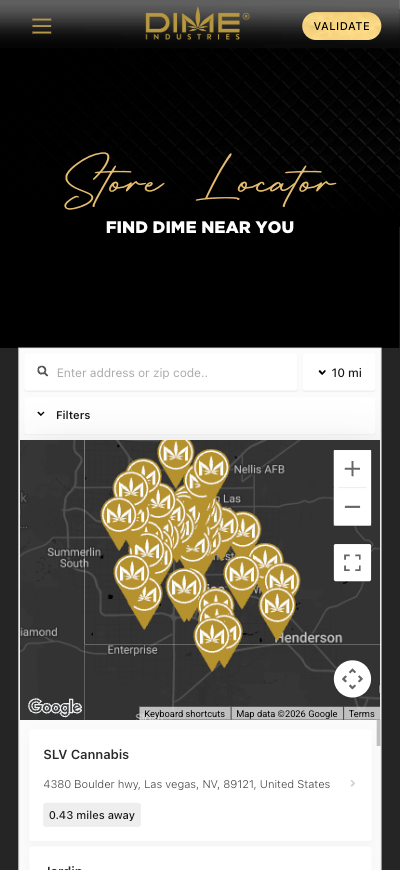
On this click-through, the map opened on Las Vegas–area pins. StoreRocket powers the widget. This might simply reflect the tester’s location/IP — not proven as a fixed site misconfiguration.
What should happen
Map should start from the visitor’s location when possible, or a clear national overview with easy search — not an unexplained regional default.
Why it matters
If the default really is stuck on one city, shoppers elsewhere may think DIME isn’t nearby and leave. Worth confirming before treating it as a hard bug.
How to check it yourself
- Open https://dimeindustries.com/find-us/.
- Look at the map before searching or granting location.
- Note whether Las Vegas–area pins appear as the starting view (as in the screenshot).
Suggested fix: Recheck from other regions and with location permission on vs off. If it is a fixed default, adjust StoreRocket (geolocation, national zoom, or clear search). Separately audit pin freshness.
Notes: /find-us/ loads; StoreRocket script is present. Las Vegas starting view is from one tester session + screenshot — cause (IP geo vs configured default) is unproven without admin access or multi-region checks.
Caveat: Might be based on the tester’s location or IP, not a site bug. Could also be an intentional Vegas-heavy default. Treat as POSSIBLE until checked from other places.
P2 (important — confusing or hard to find)OBSERVED
events · open · checked 2026-07-28
What we saw
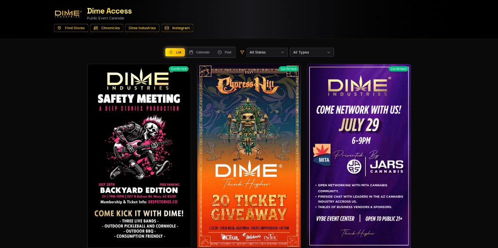
Screenshot shows an isolated “Dime Access” events experience. Live /events/ returns title “Dime Access” and is not Bricks-styled like the marketing site.
What should happen
Events should feel continuous with the brand site (shared header/footer/nav, consistent visual system).
Why it matters
Brand discontinuity increases drop-off between marketing interest and event RSVP; harder for content/ops teams to maintain one system.
How to check it yourself
- From nav, open Events (under FIND DIME NEAR YOU or via /events/).
- Observe “Dime Access: Public Event Calendar” UI chrome, typography, and isolation from main Bricks site patterns.
Suggested fix: Either restyle/embed Dime Access inside the main chrome or clearly frame it as a product with shared global nav. Align footer Lab Results etc. with canonical destinations.
Notes: HTTP 2026-07-28: /events/ 200, og:title Dime Access. Not Bricks. Separate product surface from primary WP site.
Caveat: Dime Access may be intentionally positioned as a VIP/events product. Tradeoff: product identity vs. site cohesion.
P2 (important — confusing or hard to find)OBSERVED
general ux · open · checked 2026-07-28
What we saw
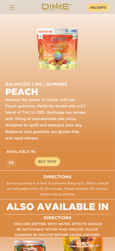
Page includes correct gummy directions and a second directions block: “Take one Softgel with water…”. Live HTML 2026-07-28 still contains that softgel directions sentence on the peach gummies URL. Same “Take one Softgel…” string also present on other live gummy PDPs checked in the wander pass: balanced huckleberry, balanced blue-raspberry, rosin watermelon, and rosin blueberry — so this looks like a shared template partial, not a one-off peach copy error.
What should happen
Directions on a gummy PDP should describe gummy use only; cross-sell modules should not inject another format’s dosage copy as if it applies here.
Why it matters
Consumer dosing confusion / trust defect on a product detail page — compliance-adjacent content quality issue. Scope appears across the gummy PDP family, not a single SKU.
How to check it yourself
- Open the live product page: https://dimeindustries.com/products/gummies/balanced/peach/
- Read the first DIRECTIONS block (gummy dosing).
- Scroll to ALSO AVAILABLE IN and read the second DIRECTIONS block that mentions softgels.
Suggested fix: Fix Bricks template partial so cross-sell “Also available” does not reuse softgel directions module; QA the full gummy + softgel PDP set after the fix.
Notes: Independent HTML confirmation of softgel directions string on /products/gummies/balanced/peach/ plus four sibling gummy URLs (2026-07-28 wander). Screenshot shows both DIRECTIONS sections on peach.
Caveat: Almost certainly a template reuse bug, not intentional softgel instructions for gummies.
P3 (medium — messy or costly to maintain)OBSERVED
locations · open · checked 2026-07-28
What we saw
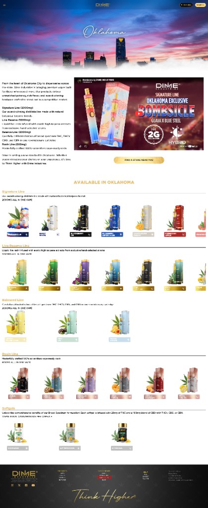
Oklahoma (and likely peer state templates) present lengthy product grids. Locations hub includes CANADA as a tile. Manual QA flags SEO and content-maintenance cost.
What should happen
Geo pages should help users find availability / retailers with maintainable, accurate inventory signals.
Why it matters
High editorial surface area: stale products, thin/duplicate geo content risk, crawl budget noise. Not an immediate outage, but ongoing ops cost.
How to check it yourself
- Open https://dimeindustries.com/locations/ and note the state grid including CANADA.
- Open https://dimeindustries.com/oklahoma/ and scroll long product listing grids.
- Note footer still exposes Lab Results (related broken destination on this template).
Suggested fix: Template review: shorter curated sets, dynamic availability where possible, canonical strategy for geo pages, and clear path to Store Locator.
Notes: Both URLs 200 on 2026-07-28. Oklahoma footer Lab Results includes broken ?page_id=17 (see QA-002). Wander pass also saw long product grids on /locations/california/ (~47 product hrefs) and /locations/nevada/ (~36) with the same page_id=17 footer Lab Results href.
Caveat: State landing pages are a common SEO play. Long grids may be intentional for coverage; cost/benefit should be measured with Search Console.
P3 (medium — messy or costly to maintain)OBSERVED
canada · open · checked 2026-07-28
What we saw
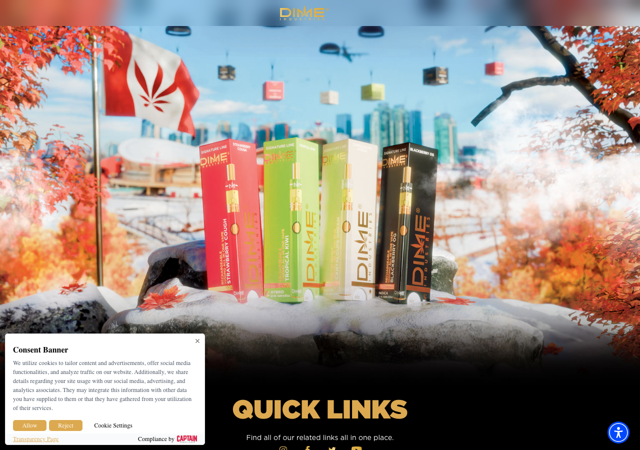
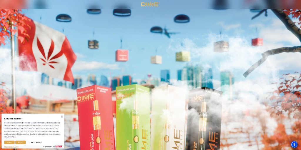
dimeindustries.ca opens as a “Links”-titled Canada landing with little of the main site’s nav and a consent banner — it reads like a separate mini-site.
What should happen
If Canada is meant to feel continuous with the US brand site, it should share recognizable navigation and clear next steps. If it is intentionally a separate legal/regional landing, that should be obvious to visitors.
Why it matters
Canadian visitors may feel lost or stuck compared with the US site. Whether that is a problem depends on legal and regional intent we can’t see from the outside.
How to check it yourself
- From Locations, open CANADA (or visit https://dimeindustries.ca/).
- Compare it to dimeindustries.com: consent banner, sparse nav, Canada-themed “Links” landing.
Suggested fix: Confirm with legal/ops whether a separate, sparse .ca experience is intentional. Don’t redesign without that evidence. If it is intentional, label it clearly; if not, align nav and next steps with the main brand site.
Notes: https://dimeindustries.ca/ returns 200 with title “Links”. Related US page: dimeindustries.com/links/. Screenshot canada-001.png shows the consent/Links experience.
Caveat: A different Canada site may be intentional for legal or regional reasons. This is an observation of how it feels — not a prescription to merge or rebuild without that context. Separately, many of those Canada nav destinations currently 404 — see QA-012.
P3 (medium — messy or costly to maintain)OBSERVED
general ux · open · checked 2026-07-28
What we saw
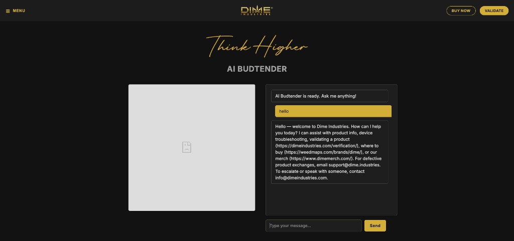
Screenshot shows broken image icon in the avatar panel. Chat works and cites verification, weedmaps.com/brands/dime/, and dimemerch.com. HTML references image filenames with spaces (e.g. GOLD DIME V2.png).
What should happen
Avatar/marketing image loads; chat answers use current canonical brand URLs.
Why it matters
Makes the AI assistant look unfinished; weakens trust in an experimental support channel.
How to check it yourself
- Open AI Assistant from main nav (links to Heroku budtender app).
- Observe large broken-image placeholder beside the chat panel.
- Send a message; note reply links to verification, Weedmaps, and dimemerch.com.
Suggested fix: Fix asset paths (URL-encode or rename files without spaces); add fallback art; audit reply URL allowlist for current destinations.
Notes: Linked from homepage as https://budtender-bdf452c7c488.herokuapp.com/. Express/Heroku app title “HeyGen Avatar Chat”. Some assets return 200 when correctly encoded; browser broken-image state is screenshot-OBSERVED in original manual QA. Agent wander pass 2026-07-28 loaded GOLD%20DIME%20V2.png and think.png successfully — broken avatar may be intermittent or asset-specific; keep open on George’s screenshot evidence.
Caveat: Not intentional. Separate Heroku micro-app pattern matches COA app fragmentation.
P3 (medium — messy or costly to maintain)OBSERVED
general ux · open · checked 2026-07-28
What we saw
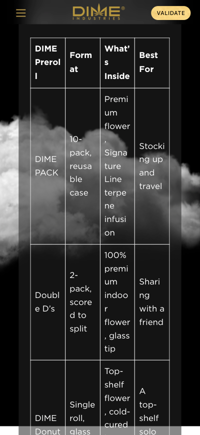
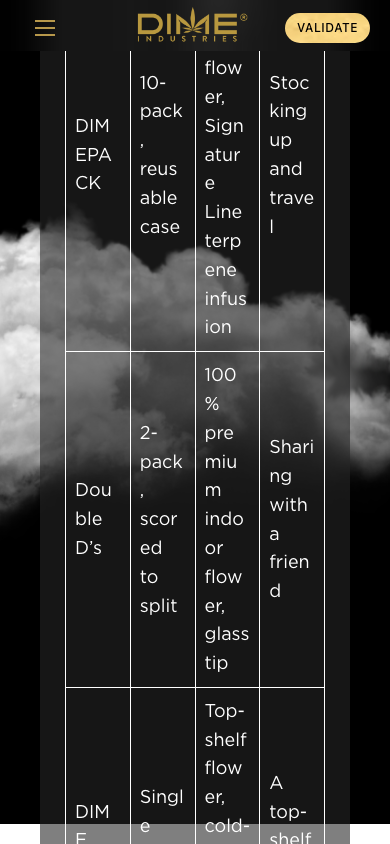
Screenshot shows comparison table with harsh mid-word wraps, harming scannability of the hardware differentiation story. Reconfirmed on ~390px viewport: preroll comparison cells ~65px wide with word-break:break-word, fragmenting strings like “10-pack, reusable case”.
What should happen
Tables should remain readable on mobile (horizontal scroll, stacked cards, or responsive typography without breaking words mid-glyph).
Why it matters
Undermines a key brand narrative page (hardware differentiation) on mobile — where much social/referral traffic lands.
How to check it yourself
- Open Built to Beat Leaks hardware story page on a narrow mobile viewport.
- Scroll to the preroll / hardware comparison table.
- Observe severe mid-word wrapping in cells.
Suggested fix: CSS: overflow-x auto on table wrapper; avoid word-break:break-all; consider card layout under ~640px.
Notes: Page returns 200. Visual/CSS issue — original screenshot plus wander-table-wrap-mobile-001.png from agent pass.
Caveat: Not intentional. Common Bricks/table responsive gap.